Friday, September 17, 2010

The Ballet Class by Edgar Degas


The Ballet Class by Edgar Degas was painted between 1871 and 1874. From 1870 until his death in 1917, the artist's favorite subject were ballerinas, either rehearsing or not. One of his friends played in the orchestra in the Paris opera house, so Degas was introduced to the backstage area of the opera. He would spend much time there.
What I really like about this painting, just like others by Degas, is that everything looks very natural. I don't know whether or not this is true, but it doesn't look like the dancers were posing for the painting. It seems as though none of them notice that the artist is there, painting.
Another major part of this painting that  I noticed was the room that they are in. Not nearly every dance studio has marble columns used as accents! Some surprising details of the painting include the watering can and Yorkshire Terrier in the bottom left corner. I wonder how those got into the dance studio...
Another thing I realized, after reading the following quote, was how good the floor looks. It's not the dominant element in the painting, but it looks very real. The wide floorboards, just like many old buildings have, make the painting look very authentic.

Degas is one of the very few painters who gave the ground its true importance. He has some admirable floors.
-Paul Valéry

Tuesday, July 27, 2010

The Last Day of Pompeii by Karl Briullov


The Last Day of Pompeii by the Russian painter Karl Briullov was painted in 1830-1833. It is located in the State Russian Museum in St. Petersburg, Russia. However, the painting had not been located there originally. Prince Anatole Demidov, who had commissioned the piece of art, donated it to Nicholas I of Russia. The Russian Emperor had the painting displayed at the Imperial Academy of Art, so that students could view the picture and learn from it. When the Russian Museum opened in 1895, the painting was moved there, so that more people would be able to view it. Also, the painting had been exhibited in Rome and in the Louvre in Paris.
The painting is very large - 15 1/4 feet by 21 1/3 feet - no wonder the artist took three years to complete the painting.
An interesting fact is that the artist portrayed himself as one of the characters of the painting. Can you find him??? You probably don't think so - unless you kow exactly what he looks like. Here's a hint - look for a dude with art supplies. Give up? In the left part of the painting there is a man with a box on his head. In the box are paintbrushes and other supplies. He seems to be the only person not panicing. But then again, why? He's not actually experiencing the terror, unlike the other people he drew.
The painting must have been awfully difficult to draw, since he had to have pictured all of the people and how they react to what's going on around them. The artist did visit the remains of Pompeii, and made many sketches, but I don't think that there was as much left of Pompeii as you can see in the picture. And you cannot fully recreate everything that is happening; I doubt somebody would agree to stand for several hours in the same pose holding another person. And I especially doubt that the artist found a dead bird lying around and decided to take it with him to add to the painting. (The bird is at the bottom of the stairs, to the right of the three people huddled together. It's hard to see in this image... so you should come to Russia to look at the dead bird.)

Thursday, July 15, 2010

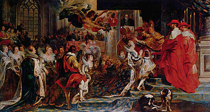
"The Coronation in Saint-Denis" by Peter Paul Rubens

The Coronation in Saint-Denis by Peter Paul Rubens is part of the Marie de' Medici cycle, a series of 24 paintings. They were commissioned to the artist by Marie de' Medici, the second wife of the French king Henry IV. Marie had ordered the paintings for a gallery in the Luxembourg Palace in Paris. The whole series is now located in the Louvre. Rubens received the commission in the autumn of 1621, and the contract and terms were negotiated and agreed upon by early 1622. The artist was supposed to have two years to work on the whole series, so that the completion would coincide with the time of marriage of Marie's daughter, Henrietta Maria. Twenty-one of the paintings were to be about Marie's own struggles and triumphs in life, the other three were to be portraits of her.
These paintings are simply undescribable - you can stare at it for hours on a computer screen, but it's not even close to seeing it in real life. I had the great fortune to see it in the Louvre, and it's certainly something not to be forgotten. First of all, they are huge - they are all about 12 feet tall, but they vary in width. This one in particular is about 21 feet wide this is one of the largest paintings in the series.. It's surprising that the artist managed to finish 24 paintings (all of which are very large) in only two years, considering the extraordinary amount of detail in each one. You could stare at the picture for hours and find new details all the time.
What I really like about this is how all of the flowing dresses and robes are drawn - they all look real, almost as if you could reach into the picture; step into it.
At first when I was looking at the picture, I though it was fairly average (except for the size), but then I noticed the people flying above everybody - some mythological people. When I looked at the other images, I noticed that most of them had some sort of mythologic scene in a part of the painting. I think that that is a good part of the images. That is what ties them all together, lets you know that they are all part of one series.
I think it's slightly funy that, in an image of a very important event, there are two dogs in the foreground, and one of them seems to be itching. If I were an artist, I would attempt to make something seem better than it actually is; if there was an imperfection, I would ignore it for the painting. Rubens, apparently, was an honest artist.

Monday, May 24, 2010

Monsieur Boileau by Henri de Toulouse-Lautrec


This painting, Monsieur Boileau by Henri de Toulouse-Lautrec, was completed in 1893, and belongs to the Museum of Modern Art in Cleveland, Ohio. Its location surprises me a little since that is not necessarily what comes to mind when I think of modern art. I tend to picture an image with some blobs of paint and then a title of what it was supposed to be. Needless to say, I don't picture the image to be what the title says. This painting, though, definitely looks like it could be Monsieur Boileau.
Regardless of its strange placement, I like this painting. It seems to capture a little moment of daily life in... wherever that is.The only thing that has me concerned is the suspiciously green substance in the glass on the edge of a table. I don't recall seeing a beverage that was that bright a green. On second though, I have, but I doubt they had Starbucks blended tea beverages in the late 1800s.
I also wonder: what are the little black things laying on the table? I wish artists would sometimes label otherwise unidentifiable objects. It would help so much.

Sunday, May 9, 2010

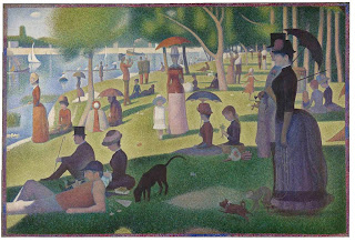
Georges Pierre Seurat's "Sunday Afternoon on the Island of la Grande Jatte"

This is one of Georges Pierre Seurat's most famous paintings, Sunday Afternoon on the Island of la Grande Jatte. It took the artist 2 years to complete the painting; he worked on it from 1884-1886.
Even though it might not be visible in a small version of the painting, it consists of many small dots that, when viewed from a distance, all blend together to make one picture. This is an example of pointillism. Knowing this, it's no surprise that the painter took 2 years to complete the painting, which is approximately 7 feet by 10 feet in size.
What I like about this painting is that it's a scene from real life. No posing, no models (I think). On the other hand, last time I checked, having a monkey that you're walking in the park isn't part of most people's daily routine. But then again, maybe that's what rich people did in the late 19th century. No TV, no internet, monkeys!
It's quite interesting how all of the people are dressed in very formal attire, and the women have their incredibly long dresses, and that's what they wore to the park. Obviously, they didn't have jeans and t-shirts, but I would think that at least the women would get shorter dresses that don't trail on the grass. You can't wash a dress like that too easily, can you?
This painting seems to capture a snapshot of daily life on a wonderful sunny day. If only our weather could be like this right now...

Sunday, April 18, 2010

Cartier Mystery Clocks

I got to see Cartier and America at the Legion of Honor (again).
The most interesting objects there (in my opinion) were the Cartier "mystery clocks." You cannot tell very well from the picture, but everything around the hands is crystal - invisible crystal. This astounded me when I first saw it. I took a closer look, "Yup; it's clear." I really had no clue how it works. Apparently they had it written somewhere in the exhibition. That surprised me; I thought it was some long-kept secret technology. I guess not. The way it works is that the center part (the rock crystal) is cut in half, and the middle part is taken out, just enough to make room for two discs, about the size of the hands. These discs are what hold the hands. They also connect the hands to the base of the clock (or where ever the clock mechanism is).
Apart from having the "invisible" clock mechanism, these clocks have some other attributes. How about the gold and diamond patterns that form the frame? Do you like a clock worth over $1,000,000? Well, who wouldn't?

Monday, April 12, 2010

Antiques - Violano Virtuoso

OK... So you might be thinking, "Antiques? How is that art? That's just old stuff..."
Nope. I mean, some antique stores are filled with useless old stuff that a granny turned in for some cash, but some antique stores are really something special.
We came across one of these good stores in Solvang. It was a huge store with all different kinds of things. They had a See's Candies scale, several pianos, a foot organ (you have to push two pedals for sound), lots of older kinds of music boxes, and various small collectibles.
But the object that fascinated me the most was something called a Violano Virtuoso. It's basically a piano and a violin that play themselves put together in one box. True, it doesn't sound too impressive considering all of the advances we've made in recording/listening to music in the past several decades. If you consider that this was made in the 1920's and that it still works, it's pretty cool. Of course, it can't play very many pieces, and it might be just a "little bit" bigger than a CD player (it's "only" about 6 feet tall).

This is a picture of part of a Violano Virtuoso.

It must have been a very creative person that came up with this idea. And how talented the people who made it were. It took them 13 years to finish the project, and it was well worth it.
Of course, these are no longer for practical uses; they have become a true collctible. Some estimate there to be about 700-800 left out of several thousand.

Sunday, April 11, 2010

Jean as a Huntsman by Pierre-Auguste Renoir

I had the great fortune of seeing an exhibition of Renoir paintings at the Los Angeles County Museum of Art this week. Out of the paintings there, this was one of my favorites.
The painting, completed in 1910, is of the artist's son, Jean. He was asked about the painting and remembers having to pose for it.
"When I was fifteen years old, I wore a jacket that reminded my father of a hunter, so he had me pose with a gun and with Bob for a hunting dog. The gun was borrowed from one of our farmers."
-Jean Renoir

What I really like about this painting is the fact that you can see the strokes of the paintbrush, but it's not huge strokes that make the whole picture blurry. They don't force you to have to step away from it in order to see the subject.
One of the things you see in many of Renoir's paintings in the background. It's there, and you know the subject is not floating in space, but it is done in a way that forces you to focus on the subject, not what's around it.
Renoir was an impressionist painter, even though later in his life he tried to separate himself from the impressionists. But even when you compare his painting to those of other impressionists, you can clearly see the difference; you don't even have to be very familiar with his art in order to be able to tell if it's Renoir or not. He paints in a way that you can really tell that it's a painting, not a photo. I admire the fact that some people can paint something that looks like a photo, but what's the point? That person didn't leave their mark, their style on it. Renoir found a perfect balance between accurateness and an artist's touch.

Saturday, March 13, 2010

Van Gogh's Bedroom at Arles by Vincent Van Gogh

This painting is Van Gogh's Bedroom at Arles, by Vincent Van Gogh. This is one of the versions of this painting. There are three versions total.
I do not understand the point of painting the painting, almost identical, again. Possibly he couldn't find anything new to paint, so he recreated older pieces to earn some money.
There are very slight differences in the paintings - mostly color-wise. The color on the walls differs slightly in all three pictures. Another difference is the color of the table. The floor color also varies from painting to painting. I doubt Van Gogh repainted his room twice over the course of two years and redid the flooring. Why did he make these objects a different color? Did this make it easier to tell the paintings apart?
It's interesting how when you look at a painting closer, you find yourself asking a lot of questions...

Still Life with Musical Instruments by Pieter Claesz


This is Pieter Claesz's Still Life with Musical Instruments. It was painted in 1623 and is located in the Louvre. Before I get to talking about the picture, I have a few things to say about the author. He was born in Berchem, near Antwerp, in the Netherlands. He was a still life painter. None of his paintings portray people. And the guy really should have used some sort of "stage name." I can't even begin to guess the pronounciation of it.
Now, about the painting. In general, it's not bad. It looks very realistic, and that's a quality I admire a lot in paintings, since no matter what I draw, it's never realistic.
One of the things I like about it is that it stands out from the standard still life. Usually, it will contain flowers, fruits, maybe a pitcher of water or something. This is the first still life I have seen with violins and a turtle! I like the fact that the painter found something that would make his still life stand out from the crowd. The objects on the table are very interesting, when examined more closely. There's a compass, a book, several unidentifiable objects on a plate ( I can't call it food - looks inedible). There's also a mirror with the reflection of the glass of... something (wine?). Off to the left, there are some more strange objects in what looks like a gravy boat, as well as a metal object with a cord around it. I suppose the artist found everything that looks interesting that he had in his house, put it on the table, and drew it. Creative.

Wednesday, February 24, 2010

Princess Elizabeth

This painting is called Princess Elizabeth, second daughter of Charles I, at the ages of 3, 5, and 6. The painter is anonymous, it's not dated. This painting hangs in the Roy Miles Fine Paintings Museum, in London.
There are several things I find strange about this painting. One of the first is that the author is so secretive about it. It's OK to let people know you painted it. It's not all that bad.
Honestly, I don't get the point of doing the girl three times at different ages. I realize they probably didn't have cameras when the picture was drawn. Unless Charles I and his wife wanted their daughter holding hands with herself, this is a strange way of tracking the girl's growth. I would have done one portrait at age 3, another at age 5, and another at age 6.
The thing that really creeps me out is the fact that she's wearing the same dress and the same shoes, but different sizes. I wouldn't have wanted to get clothing of the same style, but a size bigger. If it was my choice, I would have gotten at elast a different colored dress.
On the other hand, there are slight differences in the outfits of hte girl. (I don't know if i should be plural or now: it's the same girl, but drawn three times.) The variable is the light yellow-green scarf. In the image on the left, it's tied around the girl's arm. In the second image - crossed on her chest, in the third - under each shoulder and in front.
Another difference is the necklace. They appear similar from far away, but when you look at them, they're different. They are aso wearing differet hair accessories - the small jeweled things in the middle in their hair are slightly different.
In this painting, the young child, despite being only three years old (five and six also), doesn't look like little kids usually do. I don't quite know what it is about her, but you can tell she's some sort of royalty.
She is much taller each year. Maybe the queen wanted to brag about her young daughter who is "growing up so quickly" to all her friends, and had her drawn at ages 3, 6, and 8. It certainly looks like it!

Monday, February 22, 2010

Raffaello Sanzio da Urbino's Vision of a Knight


This is Raffaello Sanzio da Urbino's Vision of a Knight, completed in 1504.
Raffaello Sanzio da Urbino, better known as Raphael, is considered to be one of the best artists of his time, along with Michaelangelo and Leonardo da Vinci.
This might be Raphael's "vision of a knight," but definitely not mine. Where's the shining armor? And the glorious white steed? And why is he asleep!!!???!!!???!!!???
Of course I understand that the shining armor might have been less popular then, but you could have come up with a more courageous-looking picture of a knight! At least standing up...
And what the heck is he using as a pillow? What is that red thing? Is that his saddle? If it is, where's the horse?
Also, his face is so pale I would have never guessed he had spent even an hour outside. They weren't supposed to have had sunscreen in the 16th century.
Another thing I find peculiar about this is the way the women are dressed. The guy, too, but let's call that his pajamas. The females' costumes seem to be normal until you get about halfway, no matter which side you're looking from - the top or the bottom. The cloth seems to drape in a strange way. The woman on the right also has some bead-like decoration on her dress.
On the other hand, I like the way the artist showed the mountains in the back, covered by fog. The castle seems mysterious and dramatic, too.

Wednesday, February 17, 2010

The Lute Player by August Macke

This painting is August Macke's The Lute Player, painted in 1910.
The one thing that I noticed right away about this that got my attention was the fact that most of the lute is covered by the vase. This surprises me, since the painting is called The Lute Player. I would expect that the lute and its player would be very visible rather than halfway covered by a vase of tulips.
One of the other things that captured my attention was the "X" in the top left part of the painting. Could that stand for somthing?
One of the things I really like about this painting are the bright, happy colors. I like a painting that makes you happy much more than a painting of some dark, depressing room full of dark, depressed people wearing dark, depressing clothing... I think you get the point.
Another thing is the facial expression of the player's face. He (or she) doesn't seem to be very immersed in the music. They seem to be a little mad about something. Not a very friendly expression, to say the least. Maybe they were forced into lute lessons as a kid.

Tuesday, February 16, 2010

La Carmencita by John Singer Sargent


This is John Singer Sargent's La Carmencita, painted in 1890.
Overall, I really like this painting. Actually, I only have two problems with this picture.
One of them is the fact that her face is really pale and she looks like she's tilting her head really far back compared to normal or something like that. I can't quite tell what it is that bugs me about her face, but there is something.
The other thing that I have noticed is her back arm. The way her arm and her shoulder are drawn, her shoulder seems like it's raised (once again, really far compared to normal). You can also see so little of the arm that you can't quite tell that's it's attached securely to her body. It looks like it started to grow a little sideways.
Other than that, I really like the painting.
When you look at her dress, the design on it is really beautiful. It's actually a very interesting dress. The skirt, aside from the poofiness, is more or less average. For the top part, it looks like it's a regular top with some sort of a shawl draped over it. Not necessarily the average dress you see people wear a lot now, but I like it.

Wednesday, February 10, 2010

Moonlight Sonata by Beethoven

As requested by readers of the blog, I will post about music, specifically, the Moonlight Sonata by Beethoven. Why? I wish I could tell you. It's just the first music piece that popped into my head.
And guess what? It wasn't even always called that. It used to be called *drumroll please...*
Piano Sonata No. 14. Exciting, huh?
Yeah, I didn't think so. It was completed in 1801 and didn't recieve it's popular nickname until 1832.
I really love this piece of music, but (yes, there's a but) it's so hard to play on the piano!
Set aside the fact that it's really slow and I don't like to play slowly. I just don't have a large enough hand to stretch a couple notes beyond an octave! It's not my fault...
I still want to play it, but it just doesn't sound right. And my hands hurt from stretching them at least an octave without rest for 3 minutes.
Other than that, it's a really beutiful piece of music.
I wonder if some composers have their little routine to compose a new melody. Now that I think about it, composing music is tedious work. You (most likely, I really don't know how true this is) have to hear something in your head, then figure out the notes to it on the piano or whatever instrument you're composing for, then write it all down. And then do the same thing again. And again. And again. And again. Until you're done.(I just realized I could have used copy-paste. Oh well. I am a blonde...)
And then you have to hope that someone likes it enough to play it in some concert hall so you can get some money and hope your hours and hours of work weren't for nothing.

Woman Cutting by Kazimir Malevich

OK... you know the drill: this painting is called Woman Cutting and was painted by Kazimir Malevich.
I find this painting just plain strange. First of all, the woman is... big. Usually painters paint these perfect, pretty, skinny young ladies. I guess this woman was the only one around.
She also looks like she's missing a thumb of the hand that she's holding whatever she's cutting with. And what is she cutting? And what is she cutting it with? I guess the black area next to her hand is supposed to be a knife, but it really doesn't look like she's holding it, whatever it is.
Are those curtains she's cutting? When I imagine somebody cutting, I think of food or paper, not curtains... Maybe Kazimir Malevich was "too creative" for paper...


The Ambassadors by Hans Holbein the Younger

This painting is called The Ambassadors, and was painted by Hans Holbein the Younger in 1533. (I start every post like this. I should think of something new...)
Anyways, looking at the painting, you are probably wondering: what the heck is that white blob in the middle? Looks like some skull that they stretched out and tilted. I wondered that, too, and a quick google search brought me to an article that explained everything.
If you tilt it in a certain way, it's a skull! (Since you can't tilt a computer screen very easily, here's the skull as a normal image.)
You might think: yeah, yeah, just google how to draw in a cool way and that'll be on the 10th page or something. But not for Mr. Holbein!! Keep in mind that this was paintied in 1533!!!! No, it's not a typo. That's 477 years ago.
Pretty, cool, huh?
Makes me wonder, though, how bad it actually was to be an ambassador then. With skulls on the same painting...
But then again, some of the other stuff there is pretty random. Like a lute, a globe, several books, some weird blue ball and other things I don't see every day and therefore can't identify.

Tuesday, February 9, 2010

The Dance Foyer at the Opera by Edgar Degas


This painting is The Dance Foyer at the Opera painted by Edgar Degas.
I've been staring at this painting for the last three or so years, every day. (It's my mousepad!) Even after looking at it for so long, I cannot find anything wrong with it. It's... perfect!
One of the things I love the most about Degas paintings is the fact that in most of the pictures, there's somebody doing an arabesque of some sort - the people are always in action. You can actually tell that it's people, not robots that he's drawing. And (wait, it gets better) the legs look like they're attached to the body.They're not raised in some humanly impossible way, and you can tell that it's attached to the person it's closest to.
One thing interests me, though. This is supposed to be some sort of ballet class or rehearsal - whatever you want to call it. I don't quite understand who the two men are. I would suspect that one of them is the musician, but there is no piano. (I doubt the musician played recorder for the ballet.) The other man is probably the director/teacher, but I would think that he would be wearing something he can demonstrate moves in... Maybe not... Maybe the ballerinas are supposed to be so good that they can read his mind and tell what he wants them to do. Maybe those are just his comfortable dance clothes.

Monday, February 8, 2010

The Dream of the Poet or The Kiss of the Muse by Paul Cézanne

This is the painting Dream of the Poet, also called The Kiss of the Muse, painted by Paul Cézanne in 1859-1860.
It is drawn in a strange, almost mysterious kind of way. Both the poet and the muse are very pale. Also, honestly, the poet looks dead. His face seems to be very flat.
One of the things I notice first is the fact that the poet and muse have about the same skin color. Usually when I picture some heavenly body such as a muse of a ghost, I think of something very pale and white, unlike this painting, which shows the muse with a more or less average skin color.
Another thing I have noticed: where's the pen? What has the poet been writing with? There's nothing in his hand, nothing on the table. No wonder he's having trouble writing: he doesn't have a writing instrument! Duh!
The clothes he is wearing also surprise me.  At the time the picture was painted, this isn't what men wore. It looks slightly like his PJs, and I don't think they wore those outside of the bed in the 19th century. Today, maybe. 19th century... no. The woman's clothes aren't necessarily the most likely outfit for a ball either, but she has an excuse. She's a muse, and there's no required clothing style for those as far as I know.
Upon closer observation of the painting, I have noticed that both character's eyes are closed. The poet, I understand. He's asleep. The muse most likely isn't. Did Paul Cézanne have a dirty secret... that he was bad at drawing people's eyes??? We'll never know. Of his other pictures which I have briefly viewed with a google search, only one has humans with their eyes clearly drawn. That's a self-portrait. Maybe he drew eyes on himself but nobody else. Maybe he thought he could mess up his own eyes but nobody else's.

Friday, February 5, 2010

Portrait of François I, King of France by Jean Clouet


This is the painting Portrait of François I, King of France, which is located in the Louvre in Paris. It was painting by Jean Clouet in about 1530.
The thing that is instantly brought to my attention is the man's proportions, or rather, his lack of proportions. His shoulders are extremely wide, each shoulder is about as wide as two of his heads. Usually, there is about half of a head in width for each shoulder. His neck is very wide, while his head is very small. Also, the eyes are very small compared to the nose.
Another thing I notice about this is the fact that the hands seem to be more or less in proportion to the head.
Possibly, the shoulders were drawn in such a way to show the king how he is regarded as somebody with high authority, somebody with a good reputation. On the other hand, if I didn't know that this painting is of the king, I would never have guessed that. When you think of a king, (you have to admit it), you usually think of some happy, nice man wearing a red cape with white fur and black spots on it and a crown decorated with multicolored jewels. This is anything but that description. The man is wearing very nice clothes (by nice I mean something that would get you noticed, rather than something I would suggest wearing). Usually, though, when a king is portrayed in a movie, he is usually wearing many things that make you understand that the man is rich. Here, you see none of that. No huge diamond rings. No crown with rubies, diamonds, and emeralds. just a simple-looking hat with some strange fuzzy-looking things on the top.

Wednesday, February 3, 2010

Suggestions?

Is there anything related to the arts that you would like to see on this blog? Tell me!

Tuesday, February 2, 2010

Journey to the Center of the Earth (the Movie)

Upon finishing the book, I watched the movie Journey to the Center of the Earth (the new one). I must admit, it's a good movie, but is very different from the book. In the movie, it's a professor and his 13-year old nephew that go to Iceland. They go there because the professor has geologic sensors in several locations, and one in Iceland has been showing lots of activity. He is continuing the work of his brother, his nephew's father. Their guide is female, and they each "call dibs on the mountain guide," until she tells them there are no dibs on the mountain guide. They enter a passage, and instead of going down voluntarily, they are trapped inside the mountain and their only choice is to go down. While they are down there, they find some tools which they believe belonged to the first person who descended there, as described in Verne's book. They later realise that the tools belonged to his brother, who had gone missing several years ago. The only part exactly accurate to the book was when they were spit out of the volcano.
Once again, a good, funny movie, but not exactly following the book in the accurate way possible.

Journey to the Center of the Earth by Jules Verne

This is a wonderful book about a professor and his nephew who, after finding an old manuscript, embark on a dangerous journey into the center of the earth. They hire a guide, and he sticks with them throughout the whole journey, despite the several times the professor told him he would be better off going home. They do not end up getting to the actual center of the earth; they are spit out of a volcano, but this saves them from perishing deep down in the earth.

Jules Verne was definitely ahead of his time with his books. They are mostly science fiction, but most of it is somewhat possible. Of course, people are not spit out of a volcano every day, but the concept of descending into the Earth (not into the center, but into a system of caves), is something very doable.
He also has a sense of humor in the book. There are no jokes literally written in the book, but you must admit that a person without a sense of humor would not have the main character fly out of a volcano.
This book, just like Verne's other books, is very well written and I recommend reading it.

Friday, January 29, 2010

Sunflowers

This post will be about Vincent Van Gogh's painting, Sunflowers. This painting is part of a series done by Vincent. This one was done in 1888.
One of the first irregularities that I notice is the fact that his signature is on the vase itself, not in the corner as it usually is done. I also notice that all of the flowers are different. It must have been difficult to do this if he didn't have actual flowers standing in front of him. The one flower I find strange is the one on the far left, which is drawn backwards. There are brown parts on the green. I honestly don't know what the back of a sunflower looks like, but I wouldn't have drawn it with brown spots on it.
Another thing that draws my attention is the wall on the left. It has a strange white area, drawn in a graph-like way. Once again, it makes me wonder what that is. Maybe it is the way the light is falling on the wall and that's Van Gogh's way of drawing it. Maybe not.
I also find it peculiar that the flowers in the bottom part are all... not the standard sunflower. I usually imagine a sunflower to look more like the ones on the top part of the picture, with all their petals.

Young Girl with Long Hair or Young Girl in a Straw Hat


This is Pierre-Auguste Renoir's Young Girl with Long Hair or Young Girl in a Straw Hat, painted in 1884. It is located in the Galerie Daniel Malingue, in Paris, France.
Since I didn't find any information on the piece, you're going to have to read my opinion and my opinion only. One of the first things I notice about the painting is that the girl's surroundings, hat, and hair are all done in very noticable, separate strokes of the paintbrush. Her face, on the other hand, blends together a lot better. Perhaps this is simply an illusion because her face is a much lighter color than everything else. Another thing that I notice is the background. It's a little multi-colored, which makes me try to figure out what it is. Because of the way it is blurry, I doubt it's some sort of wall covering or fabric.
One of the other things that are very noticable is the lady's hair. It's a very bright color, which is very rarely seen.
Another thing that I have noticed, especially about Renoir's paintings, is that it is always called exactly what is drawn. On the other hand, in literature for example, books are often titled something that makes you interested to find out more, but when you hear the name Young Girl with Long Hair or Young Girl with Daisies, you know exactly what is going to be on the picture.

Sunday, January 24, 2010

Chekhov's "The Bear"


Today, I'll be writing about A.P. Chekhov's "The Bear." Soon, I will be participating in a play of this piece, and I suppose writing is a part of the arts, so this works...
The basic story is that Elena Popova, a young widow, had been in mourning for 7 months after her husband died. A young man (a single man), shows up at her house, and tells her that her husband was in debt and requests that she pay him immediately. She doesn't have the money, so she states that he must wait until the day after tomorrow, when her servant will return from the city with some money. He cannot wait, since he must pay taxes the next day. They continue to argue, and (obviously) she gets mad and starts to treat him in less polite ways. He challenges her to a duel, and she agrees. While Popova goes to get her husband's guns, Smirnov, the man, realizes how great a woman Popova is. He immediately falls in love with her. (Obviously, the duel is cancelled.) She also falls in love with him.
For the readers who are not happy enough with my summary, an English version can be found at http://method.vtheatre.net/doc/bear.html

I find it very interesting that Popova is able to change her mind so quickly. In the beginning, she is sure that she will never betray her husband, talks about how he was unfair to her, and how she will stay loyal to him. As soon as Smirnov arrives, she begins to change her mind. She falls in love with him much faster than she actually admits it or shows it, in my opinion. I think that she actually exaggerates how unloyal her husband was to her, only to get Smirnov to like her more. Smirnov also promised himself 5 years ago that he would not fall in love again, since he had been in 3 duels over women, he dumped 12 women, 9 dumped him. He was still able to easily fall in love with Popova.
Also, Smirnov and Popova are very different. Smirnov used to be an army commander, Popova... wasn't. I suppose it's true what they say about opposites attracting...

Friday, January 22, 2010

I'll post...

I should probably post about some more... serious art than Garfield. It might just take me a while to find something.

Wednesday, January 20, 2010

Garfield!


Let's see... I don't want to post about any real art, so it'll be Garfield comic strips for today.
Now I just need a good excuse for not "realy" art... GOT ONE!
We didn't go to any museum, therefore, I didn't see any art, therefore, I cannot write about any art since I "don't geet enough feeling and emotions if a I stare at it from a computer screen." Man, I'm good.

Now for the commenting.
The only thing I can really say, doesn't that guy who draws them get tired of the same characters all the time?

Tuesday, January 19, 2010

Change... sort of

Originally, this was "a blog about art." Now I made it "a blog about the arts," which means that I can make my own life easier and write about dance and stuff like that, not just drawings.

Monday, January 18, 2010

Cartier


Over the weekend, we visited the Legion of Honor to see the "Cartier and America" exhibit.


I just don't understand how it's possible to create such wonderful works of art. They are so small, yet they make a big statement when you show up wearing a Cartier diamond tiara.
I can't imagine how hard it is to make these precious pieces of jewelry. You must be so careful to place the diamond perfectly, most likely it's very difficult to take it out of the metal to reset it. You must be careful not a drop the diamond under your table, where you won't be able to retrieve it until some cleaning lady finds it... and keeps it for herself (finders keepers).
There were several "mystery" clocks, and it appeared as though the hands of the clock were floating in mid-air.
Many of the jewelry pieces on display were made for or purchased by Marjorie Merriweather Post, who was heiress of the Post Cereal Empire at the time the jewelry was created for her. She gradually became the richest woman in America. To me, it seems a little strange, that a cereal company owner would be so rich. Cereal is something that isn't all that expensive, and I can't quite imagine a cereal lady owning as many jewels as there were belonging to her.
Another aspect of Cartier in America that surprised me was the condition of all the pieces on display. Many of them are about 70 years old, some older, and they are in perfectly fine condition. Of course, one doesn't wear diamond, ruby, and emerald pendant every day of the year, but I would imagine them to be in worse condition.

The Russian Bride's Attire

This piece of art is probably my favorite at the Legion of Honor in San Francisco.


What surprises me the most in this picture is everybody's look. The eyes are drawn in such a natural way!
Another attribute of this image is its size. It's enormous and covers almost the entire wall it hangs on. It's a stunning 110 x 147 inches (279.4 x 373.4 cm).
This painting, by the Russian artist Konstantin Makovsky, was painted in 1887 according to the museum, but some sources say that 1889 was the date of completion.
But there's a trick to this painting. There are at least two versions of this painting. There's the large version, which is located in the Legion of Honor, and there is another one. It was done in 1884 and is significantly smaller, at 92 х 145 cm. This one is located in a museum in the city of Serpukhov, close to Moscow, in Russia.
Take a close look at the image on the left, and the one on the right.(they can be enlarged by clicking on the image) Can you find the differences?
In the one on the left, in the left corner of the room, there are two ladies, one of them facing the wall, so her back is toward you. In the other picture , there is one lady with a headdress that is most likely going to be put on the bride.
Also, in the image at the Legion of Honor, in the top left corner, the chandalier is covering the entire object on the shelf (an icon?) and in the other, most of the icon can be seen.
I haven't found any reason or explanation for the two versions. Perhaps one of them was simply a "rough draft." I could, of course, make up a crazy story about how one version was lost, then recreated, then found, but that would be lying, and lying's not good...

First Post!!!

In this blog, I'll be posting daily* about art. I'll try not to make it boring and choose art worth writing about. (I won't write about my 3rd grade replica of Starry Night)


*maybe not so daily... I've noticed some blog writers have difficulty posting every day, so I won't set my goals too high.